Part 1 – The Ancient Design
Tokopedia’s seller’s order processing system has been used by millions of merchants across Indonesia for more than 5 years yet never once been revamped – the outdated design is no longer capable in catering to the current or future use cases. Instead of merely revamping the visuals, we created a modular and dynamic template system to safely accommodate the endless additional components in the future without ruining the design.
Part 2 – Investigation: Defining Goal and Finding Sweet Spots For Problem
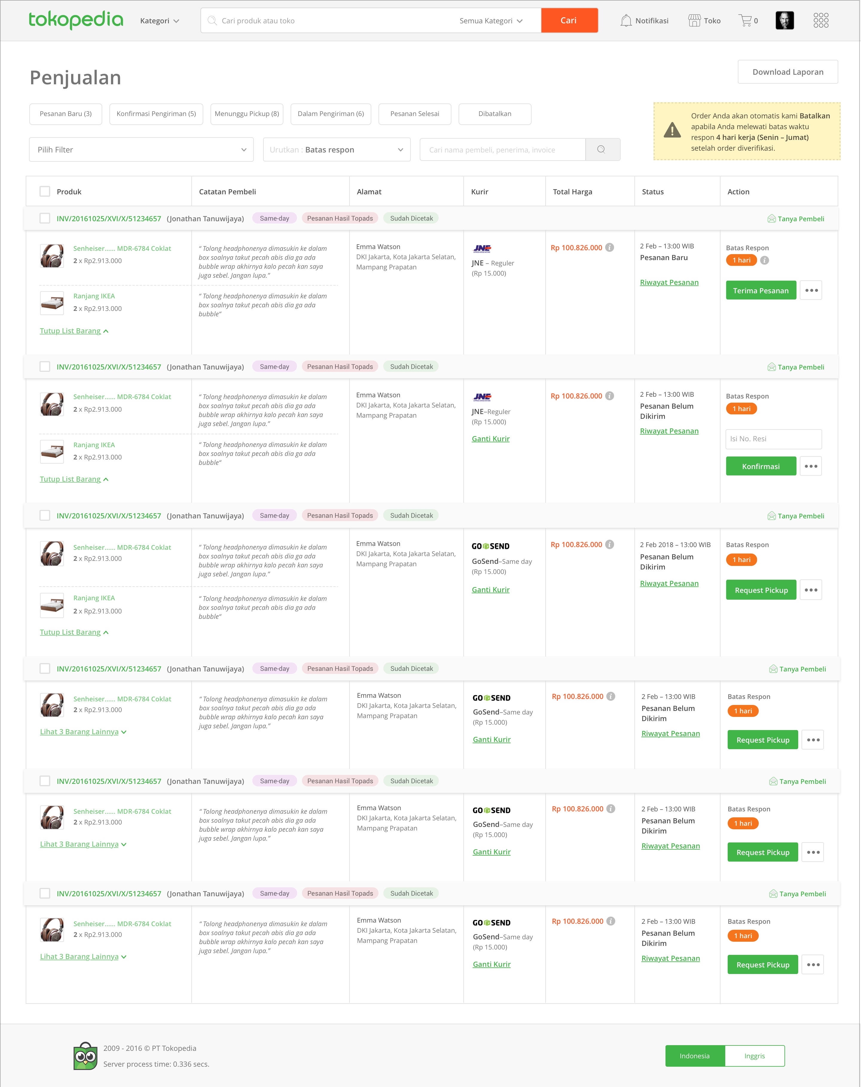
The order lists’ layout on each order statuses are extremely different to each other although they contain similar sets of information. Here are several examples of the cluttered order list:
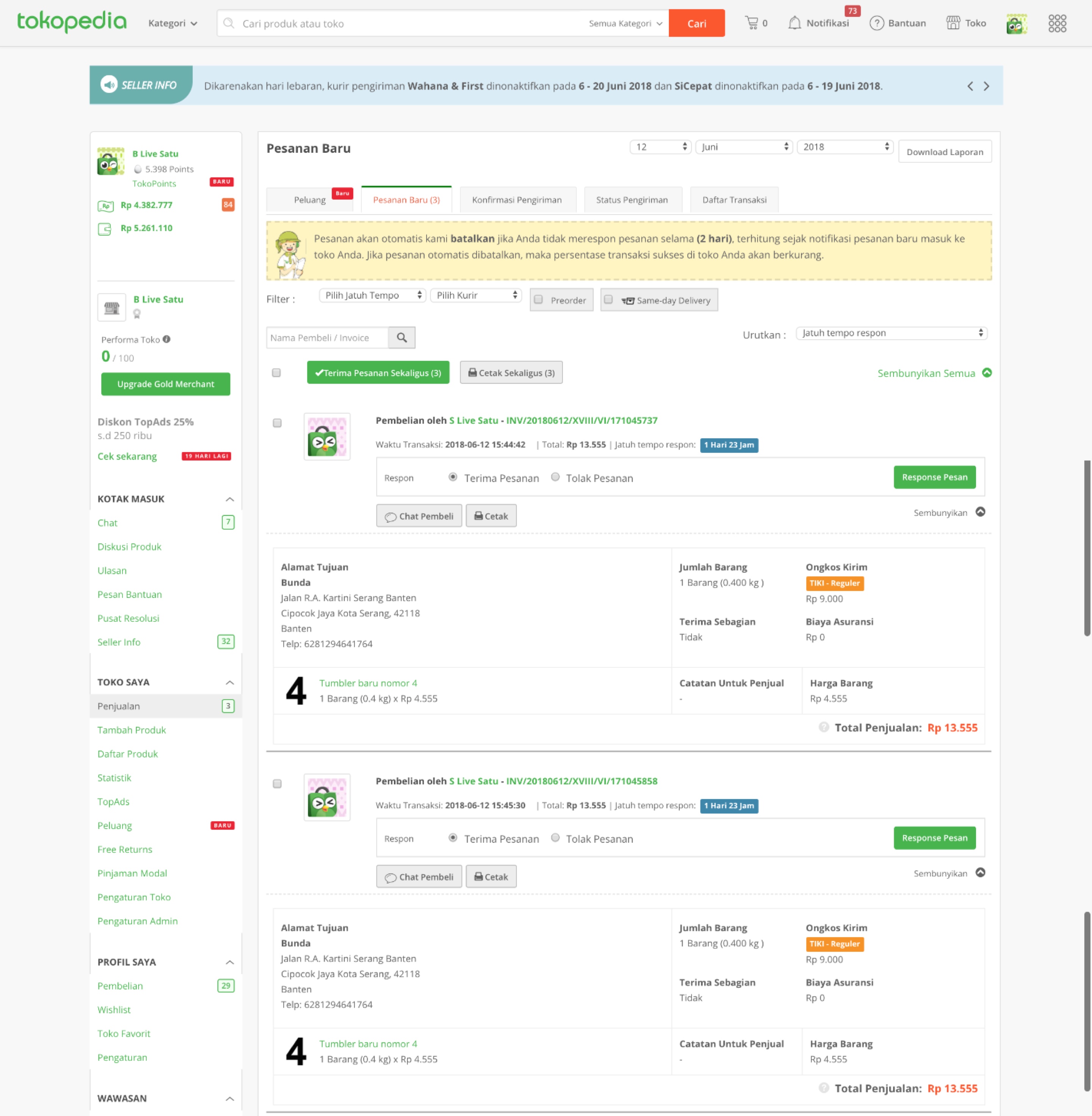
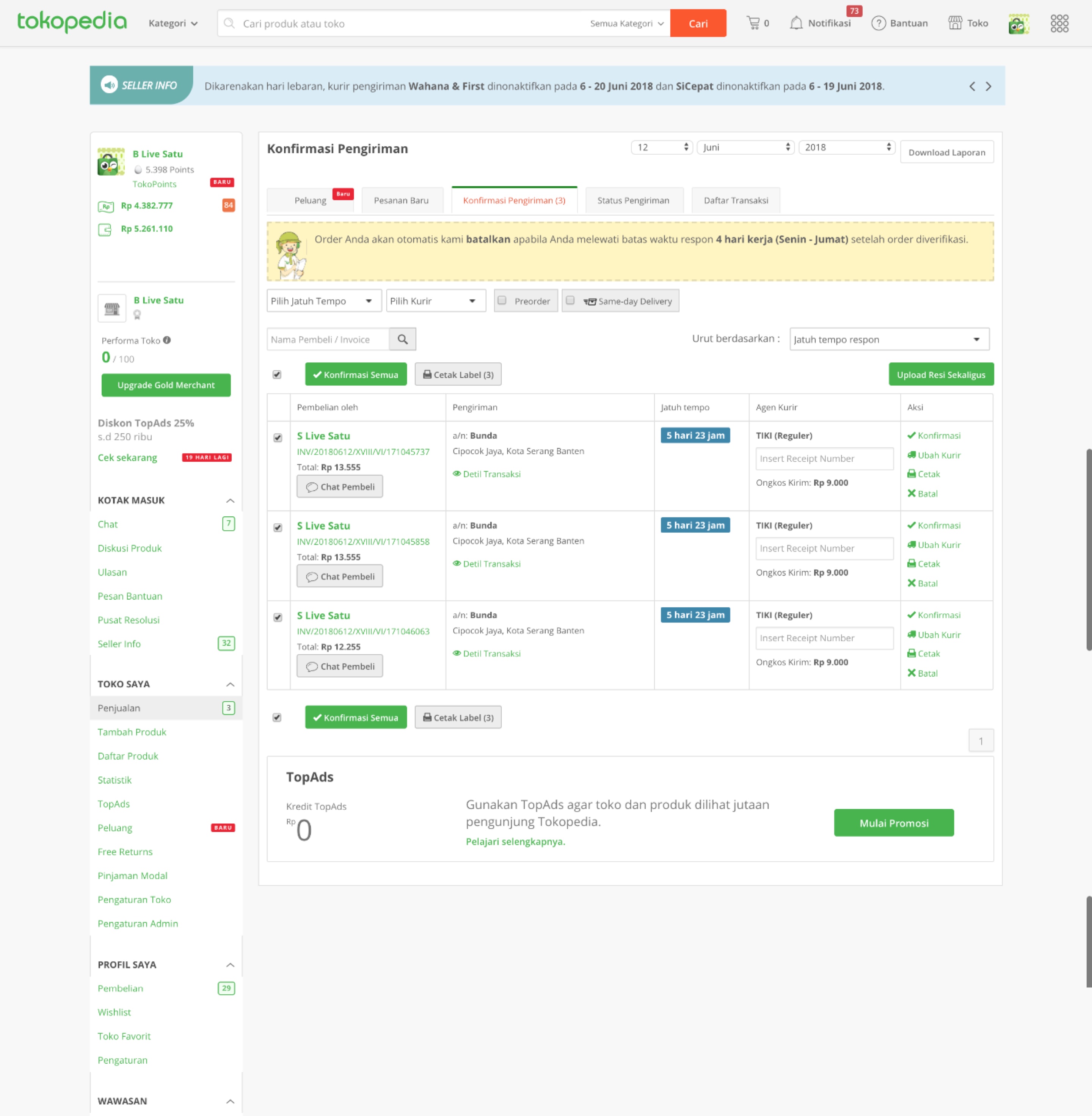
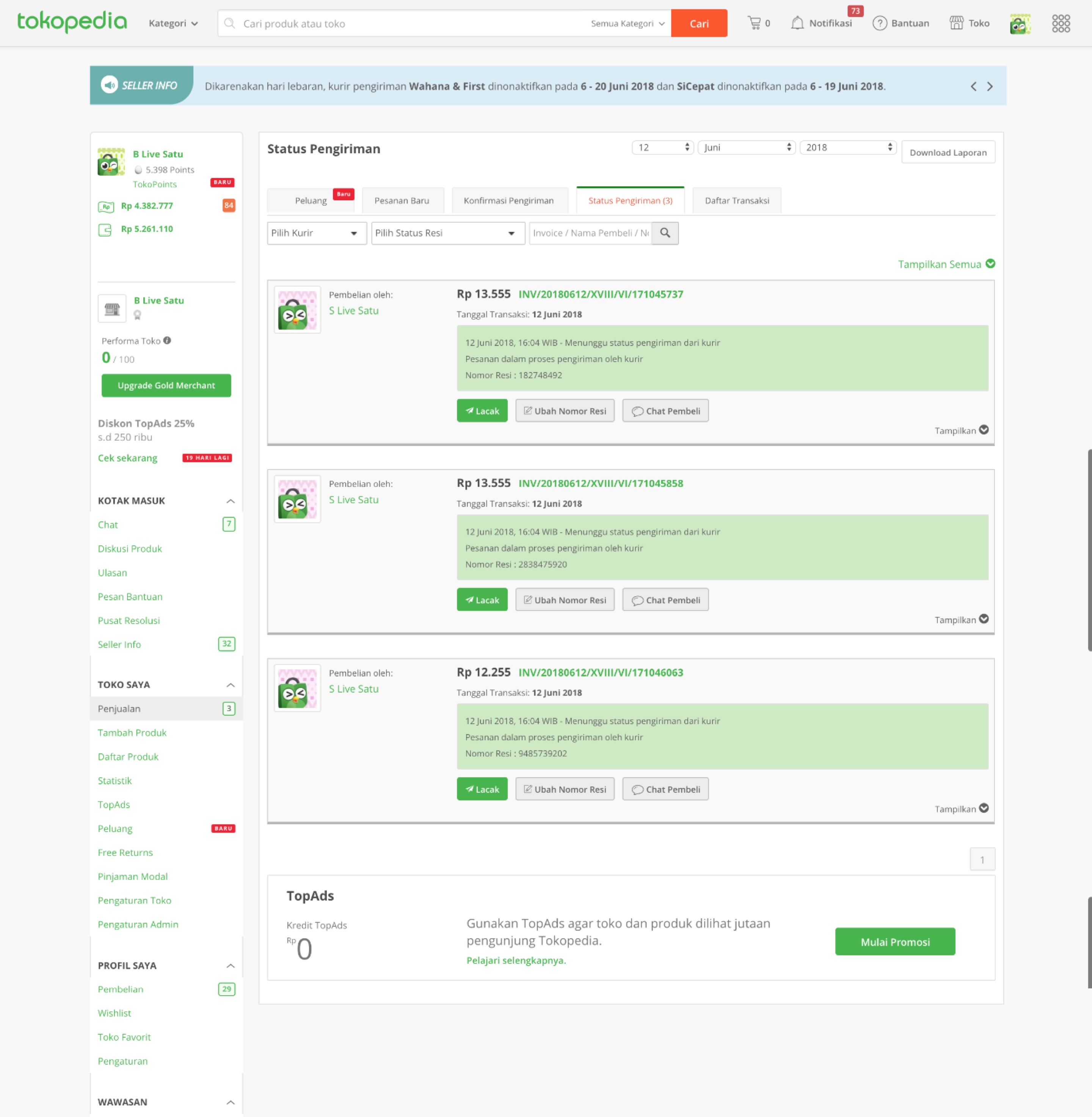
User Research Segment

To solve the cluttered layout problem, the design goal is to create a unified and modular order list in a tabular format that could cater to all status and use cases. For this revamp, the measured metrics are happiness (user satisfaction) and adoption (amount of user converting to the latest version).
To create a product that aligns with the seller’s context, we conducted multiple seller visits to investigate pain points and observe their behaviour when using the product.
Part 3 — Fixing Something That Ain’t Broken
Surprisingly, after visiting 7 sellers, aside from logistic-related problems which is out of our control, none of the sellers claimed to have any problem or complain about the product. On the contrary, they were highly satisfied with it and most of them requested us not to radically revamp the product to avoid a steep learning curve.
On the contrary, they were highly satisfied with it and most of them requested us not to radically revamp the product to avoid a steep learning curve.

Part 4 — Connecting The Dots: Mapping Everything
Seller Visit Pain Points

Before jumping to the design, we need to understand the product’s dependencies, limitation and use cases to achieve sustainable, viable and consistent design.
Still unsatisfied with the result of the seller visit, we tried to spot problems from multiple angles. Consistency is the main issue of the design, therefore we mapped out and synthesised all sorts of findings to spot solution opportunities.
Gathering all product components and insights could assist us in designing the guideline to achieve modularity without compromising the layout’s design. Below are the type of mappings we’ve gathered:
- Information architecture of existing design
- Seller’s behaviour pattern
- Common and less commonly used features
- Grouping problem type
- Improvement request
- Cases and statuses
- Rules of external parties (logistic and merchant)
Common Order Processing Behaviour

Part 5 — The Design Experiments
It’s definitely challenging to achieve a unified design that could cater to all use cases. Referring to the tabular layout, here are a few of the initial layout experiments:
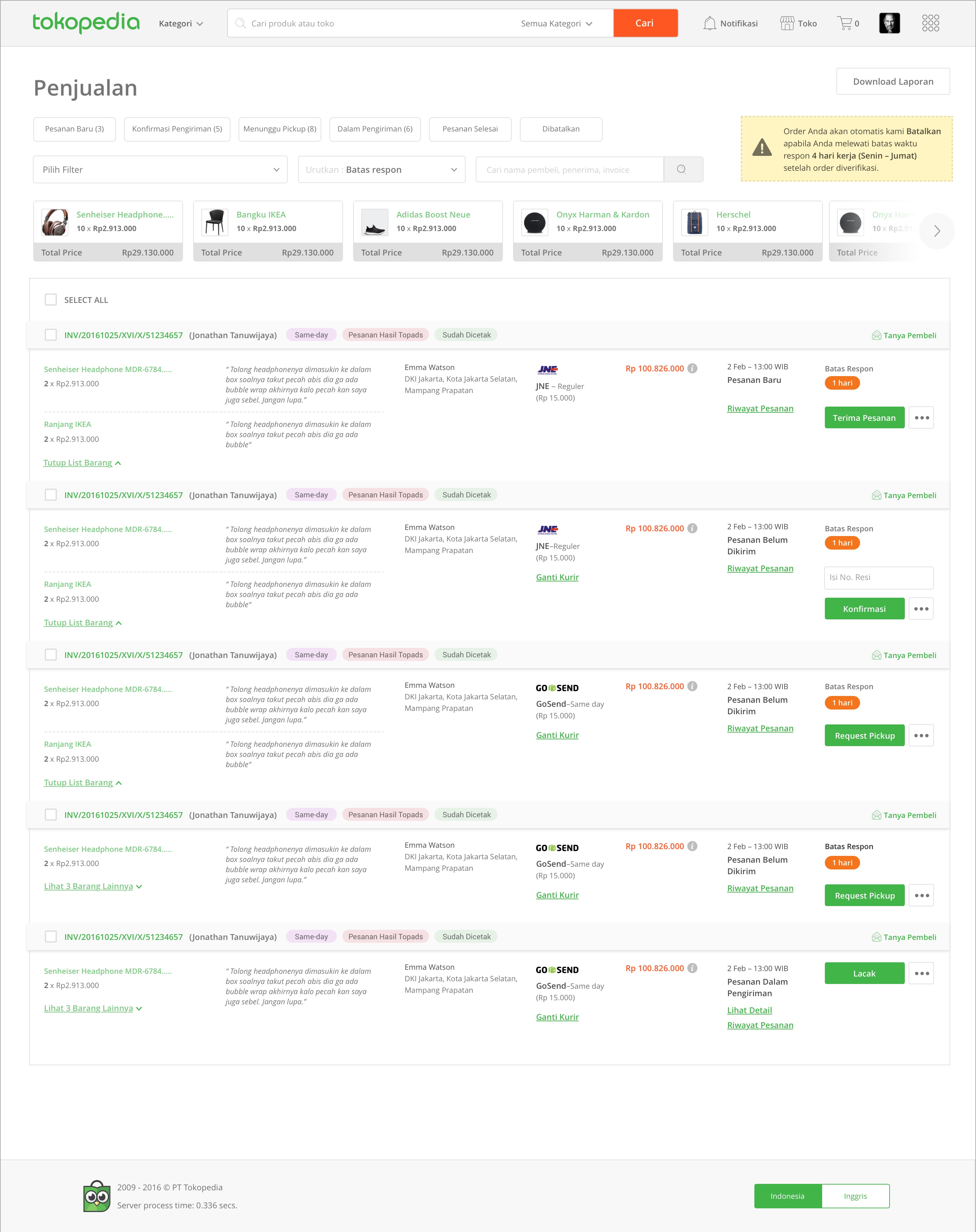
Unfortunately these designs weren’t able to cater to all use cases, so we constantly tweaked the it to achieved a viable layout. The design was tested to 9 users, among them 3 were big sellers with a minimum of 50 incoming orders a day.
Part 6 — Testing The Design

The insights were divided into 2 parties – the small-medium sellers were more satisfied with the old design since they are highly accustomed to it and didn’t provide positive remark on the new design.
On the other hand, big sellers were satisfied with the new design due to the fresh look and ease in processing multiple orders. Here are the list of significant changes:
- Expose order detail – Better experience in reviewing order detail without clicks.
- Simplify order acceptance through auto-accept order feature – Every seller we visited claimed to instantly accept every received order without checking their product stock. So we automate the order acceptance process.
- One tab filter – All orders are on the same page, only different states.
- The illusion of low learning curve – maintain the existing order processing flow and the filters in the one tab concept.
Since our initial phase is to achieve modularity, which has been achieved through the design, we decided to proceed with the design although most small-medium sellers weren’t satisfied. Here are the minor tweaks to slightly increase the adoption rate among small-medium sellers:
- Eliminate auto-accept order since sellers were worried about the penalty rules in the existing system.
- Provide more negative space to avoid cluttered visuals.
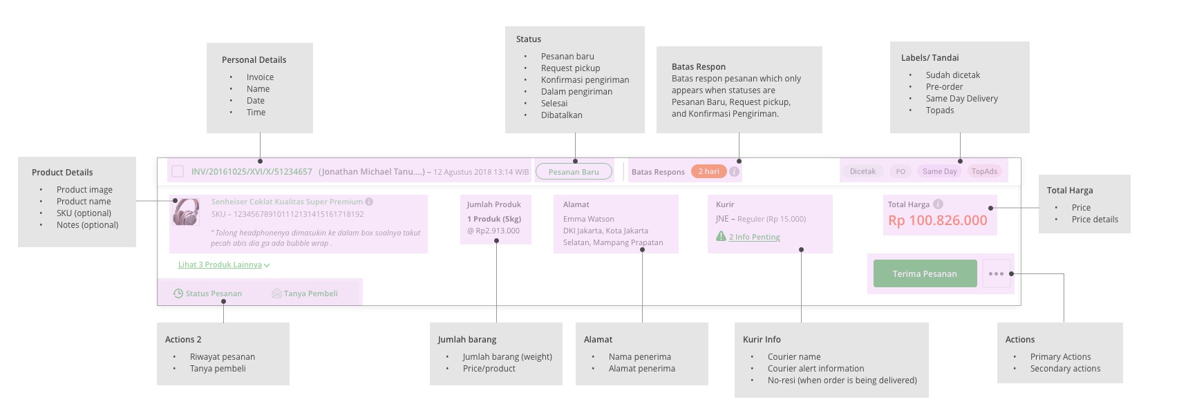
To avoid inconsistent layout when more elements are added to the design in the future, we made the order list guideline to cater to all 16 different use cases and future use cases.
Card Guideline
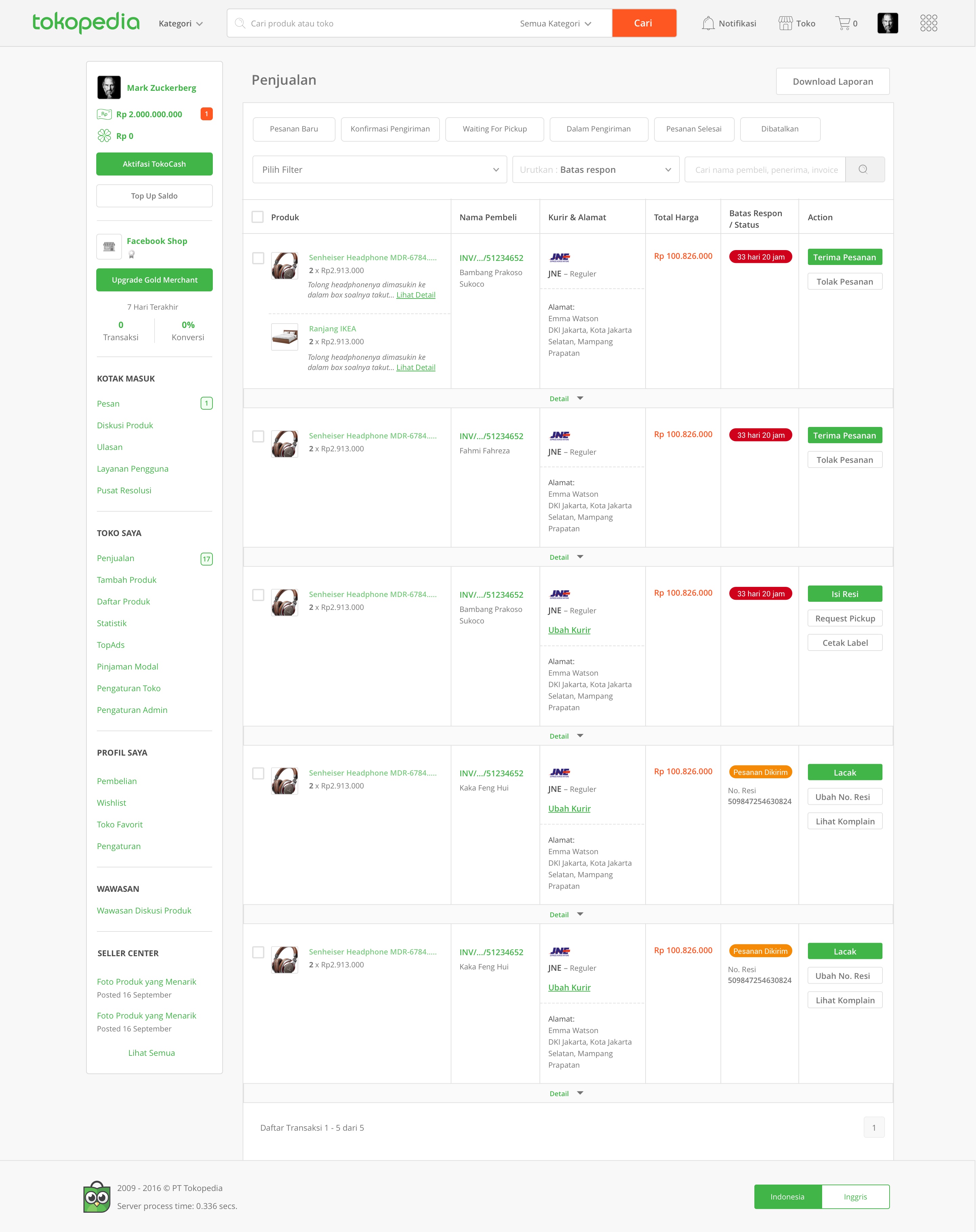
Part 7 — Final Design and Development
Credits to the super team who help bring this project to life: Fauzan Ramadhanu (Product Manager), Prudence Djajadi & Idwan Ula (UX Designer), Misbeh (UI Designer), and Fachran Dhani (Front-End developer)
After formulating the template, the design was handed over to UI and proceeded to development. Below is the example of the finished product.
Onboarding to introduce the newly designed platform
The one tab mechanism to achieve layout modularity
Easy access to commonly used actions
Part 8 — And The Result is?
- Order completion rate: 10% increase
- Order cancelation rate: 2% decrease
- Error rate: 3% increase due to technical instability.
Seller’s satisfaction score: Average of 3.2 out of 5. Most claimed they prefer the old version to the new. On the first month of its release, we received multiple complains simply because users weren’t used to it yet. Fortunately, the complaints gradually decrease meaning users are starting to get used to the system. From the results, here are the learnings:
- Release the module in several phases instead of changing it completely at once.
- Involving stakeholders when observing users can speed up and smoothen decision-making process.
- Involving developers in user testing improves their product ownership.